Today we’re announcing the availability of the completely redesigned Gliph mobile web application. In this entry I’m going to go over the advances we’ve made and briefly why mobile web is important to the future of Gliph.
A Bit of History
When Gliph first debuted it was a mobile web application (website) and that’s it. We worked on it during the winter of 2011 and put our first version online around the start of January. At the time, it only worked in Mobile Safari and was barely a proof of concept.
Gliph was always intended to be a “real” native mobile app, however. We quickly turned our focus to developing and releasing the iPhone and Android applications. That meant tuning the API to Gliph’s backend just for these apps. Soon, our expanded feature set was calling for mobile web pages that our old architecture was not equipped to handle.
While we tried to make sure the mobile web could deliver the same functionality as our native apps, we had significant visual design updates that we couldn’t bother to bolt on to the old mobile website. Eventually, our mobile web and native experiences lacked feature parity and provided totally different user experiences
Native Product Development is Distractingly Sexy
There is a strong magnetism to develop native apps, especially when it comes to iOS. As of today, 2/3rds of Gliph’s users are using the iPhone application. iPhone releases get more attention than native web applications.
Web applications are a ways behind the groomed experience offered on iOS. Mozilla, Google Chrome and Microsoft all have native app stores, (which we will be submitting Gliph to). However, I’ve yet to hear from anyone “you have got to install this mobile web app on your home screen.”
In the echo-chamber of mobile technology, even Android seems to garner much more attention than mobile apps. Charles Arthur and Stuart Dredge went into great depth in their June article for The Guardian on why native iPhone development is more attractive than Android. However, you have to peer into the comments to find anyone arguing on behalf of mobile websites.
Five Steps Back, Ten Steps Forward
As Gliph’s feature roadmap has blossomed, our need to experiment has grown. We quickly found that it was not practical or efficient for our team to create finished features in iOS. New ideas that required backend changes could be prototyped more quickly in HTML
We finally reached a breaking point. The mobile web has become our lab for new features (including Lockdown) and our beakers and test tubes were spilled all over the place. It was no way to operate an R&D space.

Gliph Mobile Web 2.0
A lot of what you see in the new Gliph mobile application is modeled after the existing iPhone application. In fact, if you load up the new Gliph mobile web app on an iPhone and choose Add to Home Screen, it is so similar to the iPhone application it is uncanny.
If you look a little closer, you’ll find that, the mobile web now leads the Gliph iPhone application. It has some interface refinements and updated visual treatments we’re excited to share:
- Revised conversation view – We’ve updated the look and feel of the conversation view to use more colorful thought bubbles and provide more friendly date information.
- Updated Gliph View – Gliph View has been updated with some new visual treatments.
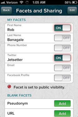
 Updated Connection Settings – When you click Edit the facets I Share on the revisedGliph View, you’ll see a visual refresh on the Edit Connections page. Besides some better looking sliders, you’ll now get a visual indicator if you have a public facet that is not shared in the connection.What we found was that even if you share your first name publicly on Gliph, and then chose not to share it with a particular connection–it wasn’t obvious that your contact could see it after all. So, a new red glow appears around an off-switch that actually is ‘on’ because it is set as a public facet.
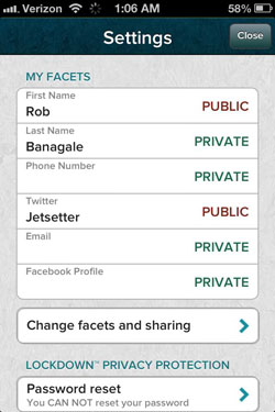
- Revised Settings Page – The settings page has been slightly re-worked. We now show up front exactly which of your facets are public and which are private. You can then dive deeper to make changes on the Facets and Sharing screen.We found that sometimes we would accidentally toggle one of our Facets publicly. You definitely don’t want to accidentally reveal your phone number, so this change fixes that.We highlight all facets you’ve chosen to share publicly with the same red glow from Connection Settings. This is to further accentuate, “this is public, be careful!” You might also notice that adding new facets is now a more attractive process.
Final Thoughts
We’re very excited about this release and what it means for our future product development. We encourage you to try it out, especially if you’re sitting at the computer and want to be able to type your messages back and forth with another person on Gliph. We’ve worked to give it compatibility on all modern browsers, including Chrome, Firefox, IE 8 and 9 and Opera.
If you have any feedback or questions, we treasure comments. Please send them to us using this form.